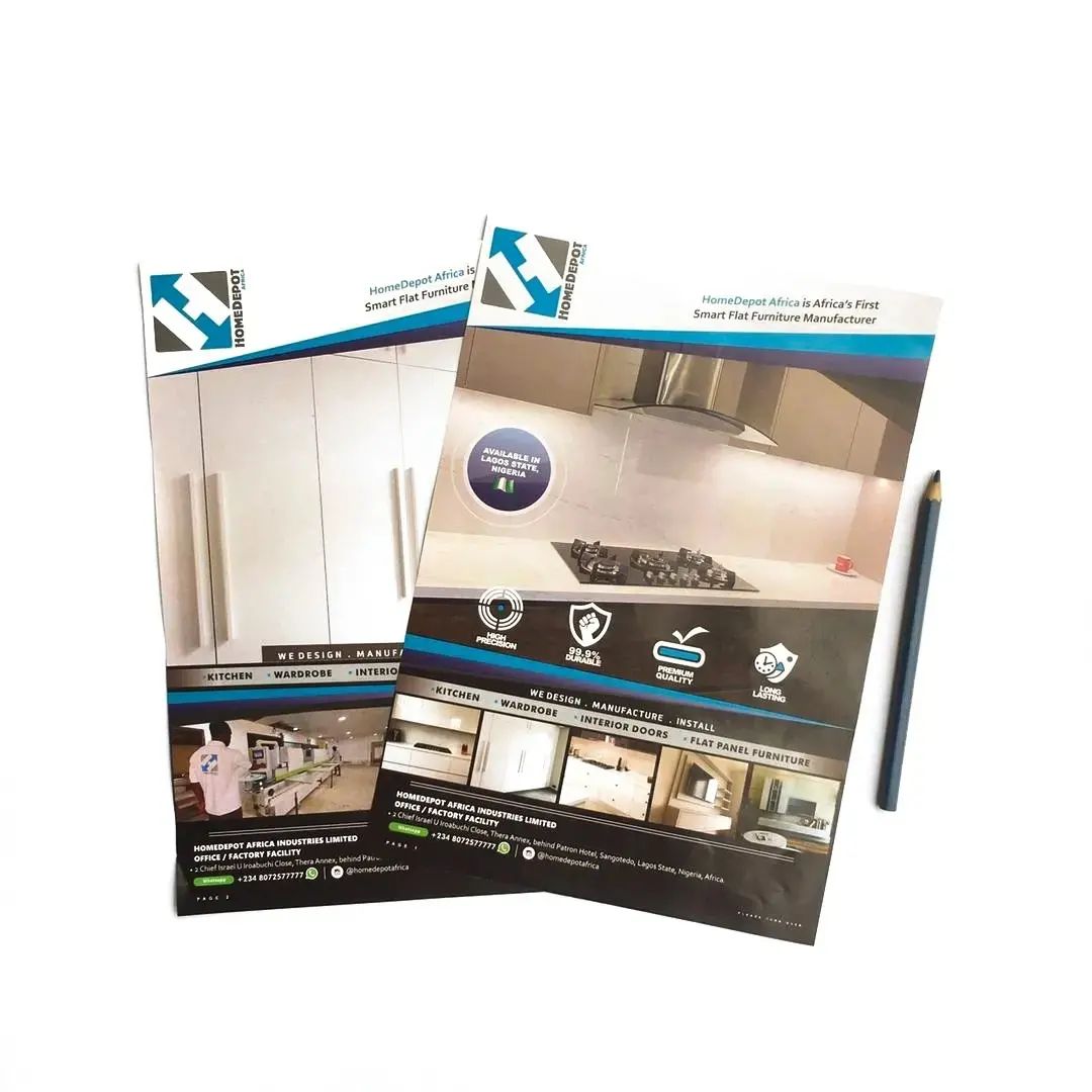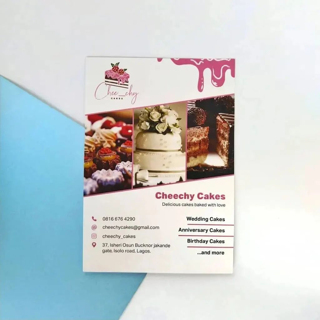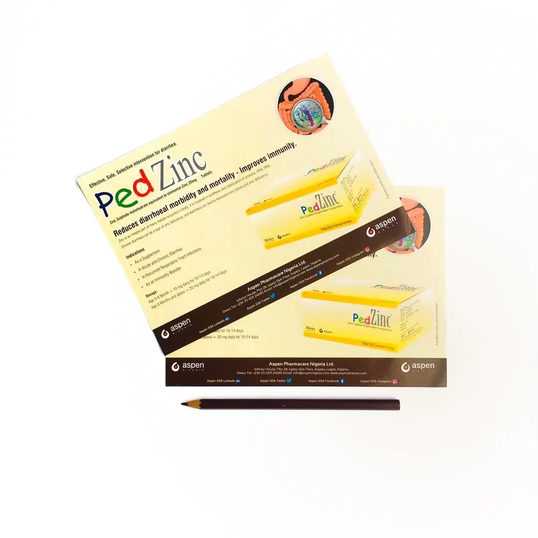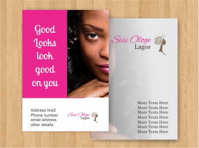
Flyers are inexpensive marketing materials useful for promoting products, events, and services. They are well known because of how effective they have proven to be over the years. Flyers are often printed in diverse sizes depending on their usage and choice of the user. The sizes include A4, A5, A6, DL, and A4 flyers.
These leaflets can be shared at trade fairs, on the street or you could simply have them picked up at your store. Whatever be the case, know that flyers only work when they are distributed, especially to the right audience. Consequently, it is important for much attention to be paid to elements like the design, color, choice of words, and lots more. Your failure to do this will likely make your flyers rejected or hurriedly dumped by clients and prospects after a quick glance.

So, here are a few rules to making exceptional flyers;
Know your audience
Proper understanding of the type of audience your flyer targets would help to set the tone for your write-up. For instance, if your target audience is secondary school students, you should know better than to put words that are not easily understood.
Keep your words simple
Clients and prospects only get to make an impression about your brand through your flyers within seconds. So the inability of your audience to get the message within those few seconds isn’t would make you lose out on prospects and even clients. Therefore, avoid the usage of ambiguous words and also remember the KISS (Keep it simple and short) rule.
Prioritize your words
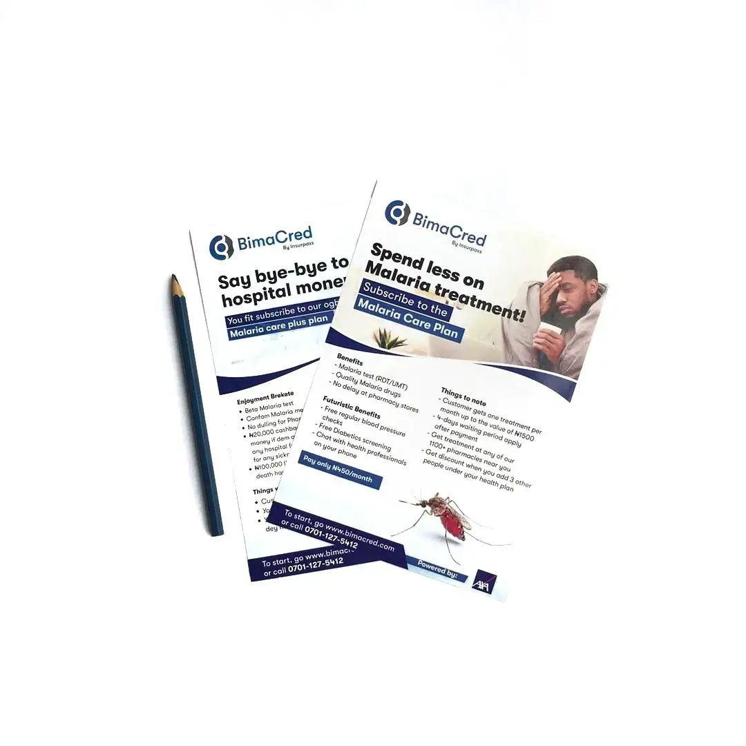
Make sure that the vital message in your flyer appears at the top and is visible enough for all to see even from a distance. Also, ensure you use a clear font. You wouldn’t expect your clients and prospects to strain their eyes while trying to read the words on your flyer. Remember, your prospects only have a few minutes to make an impression with your brand.
Space your texts
People are more likely to enjoy reading a text that is well-spaced than a long paragraph. Whether you are stating your product features, price, specific dates, etc, ensure they are well spaced and pleasant to the eye.
Include a Call-To-Action
This simply means what your audience is expected to do after receiving your flyer. It could be dialing your customer care line, visiting your website, etc. Just remember to keep it short and concise. Your readers may get confused when you tell them to carry out more than 1 action.
Be creative with your colors
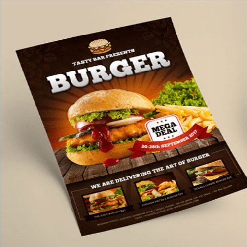
You don’t want to use colors that would turn off your prospects at the mere sight of your flyer. It is more advisable to use pastel colors though. Similarly, choose colors that suit the brand you are trying to promote. For instance, colors like yellow and orange are associated with food brands. Therefore, the dominant colors on your flyer should not be otherwise.
Use quality images
Flyers with images would likely attract more people than those without any. However, understand that only quality images would attract the desired attention.
Choose clear fonts
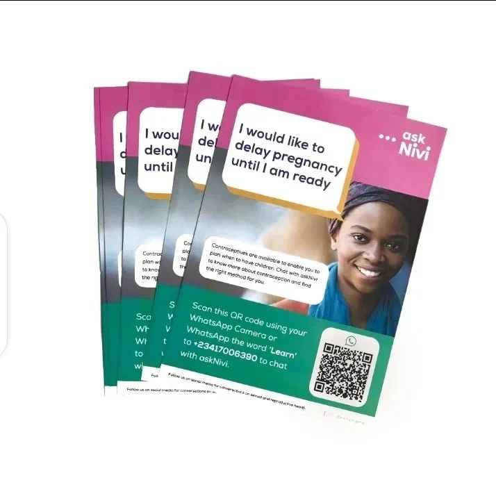
When choosing fonts for flyers, remember to pick clear and interesting ones. Using fonts that are not clear enough to write key messages would only jeopardize the effectiveness. Your focus message should be in bold.
An effective flyer is a mixture of striking design, clear images, and flawless finishing. Always put yourself in the shoes of your prospective customers, that way, you’ll be able to give out creative and effective flyers.
