Should coming up with a business name be as difficult as forcing a camel through a needle hole, deciding on a befitting logo can be likened to convincing an Elephant to do same. Described by The Urban Dictionary as a graphic that is trademark of an organisation and is used to recognise that organisation, many Nigerian businesses (especially SMEs) often find themselves at a crossroad when it comes to deciding a logo choice. In as much as there are varying factors responsible for this constraint, the shallow understanding of designs and how it works tends to claim the lion’s share.
For this purpose, we approached 5 popular Nigerian startups with very cool and somewhat cryptic logos and talked them into revealing the idea behind their creativity. The Companies include: MAX, MicroTraction, Paystack, Flutterwave and Ventures Platform.
-
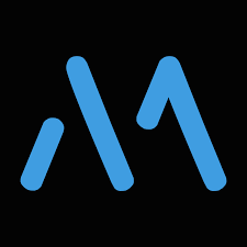
MAX
MAX is on a mission to fix Africa’s notorious last-mile delivery and online-retail problems by using mobile and web platforms to connect consumers, retail businesses and independent drivers in real-time.
The MAX logo (Icon only) has been creatively designed such that it contains all the spellings of MAX. A closer look at the white space will reveal the infinity symbol which depicts the length at which the company delivers on promises made to its customers.
-
MICROTRACTION
Microtraction funds smart, relentlessly resourceful founders who are building high growth, technology driven businesses in $Bn markets.
The company opted for colour Blue because it signifies trust. The logo (Icon only) is an M as well as signifying twin peaks, indicating that startups are successful because they’ve conquered both peaks.
– Product (Peak 1) – Market (Peak 2)
- VENTURES PLATFORM
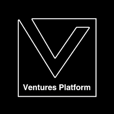 Ventures Platform invests in visionary founders, who exhibit grit and
have a mission driven approach to solving real problems in Africa.The VP logo (woodmark+Icon) is a combination of black and white – two classic colours.Black for Ventures Platform represents strength of mind, will, and character. While white is safe and open (indicative of the environment we have created for startups to thrive), white is also blank, like a canvas – space to build the future.
These two simple colours have been chosen because the company believes in the simplicity of execution and first principles especially at the early stage.
The VP logo is shaped like a funnel because the intention of the company is to filter and guide the best ideas and support them to scale.
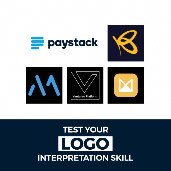
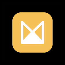
- PAYSTACK
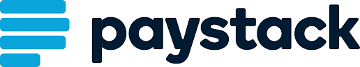 Paystack helps Nigerian businesses accept payments from anyone, anywhere in the world.The name Paystack fit tight and snug into the concept of trusting easy. A stack seems like an easy thing to create, imagine if the name was “paypuzzle”. The trust part was ironically the easier part, the stability of an organised stack would have a trusting presence. The name became a metaphor for trusting easy. Hence the reason why the company maintained the use of the letter “P” from the old logo and converted it to a stack in this new one (Icon+Woodmark), so once you see it you just get it. What is familiar is easy to perceive and trust.
 - FLUTTERWAVE
 With a mission to power a new wave of prosperity across Africa by enabling global digital payments Flutterwave’s logo is as simple as its complications.
Flutterwave is a name its founders gave to a phenomenon known as the butterfly effect as depicted on the logo (Icon only). This effect describes a natural occurrence where small changes in an ecosystem as little as the flap of a butterfly’s wings change the entire ecosystem Because of after order effects that cascade to the entire ecosystem E.g the flap of a butterfly’s wings can change the direction of a tornado The yellow butterfly represents this effect which we hope to have by building modern payments infrastructure to connect Africa to itself and the global economy It’s small and invisible, often underrated but very impactful.
Now you can see the enormous thinking process that usually go into the formation of a unique logo. Most times, business owners find it difficult to come up with a worthwhile logo, prompting them to changing their logos every now and then- a move which often hurts branding.
This perceived difficulty is what has led the Printivo team to coming up with a collaborative logo creation method. This process which involves the contribution of both the design team and the customer in coming up with a logo which’d stand the test of time.