 Design plays a crucial role in the success of your printed materials. A well-designed print material can make your brand stand out and leave a lasting impression on your target audience. But, designing an eye-catching print material isn’t always easy.
Here are some tips to help you create designs that are both functional and visually appealing.
- Keep it Simple: When it comes to designing print materials, less is often more. Too much clutter can be overwhelming and detract from the overall message of your print material. Keep your design simple and uncluttered. Use white space to your advantage, and make sure your message is clear and concise.
- Use High-Quality Images: High-quality images can make a huge difference in the overall look and feel of your printed materials. Make sure your images are high-resolution and look great in print. Avoid using low-quality or pixelated images, as they can make your materials look unprofessional.
- Choose the Right Fonts: Fonts play a crucial role in the overall design of your printed materials. Choose fonts that are easy to read and fit the overall style of your brand. Avoid using too many different fonts, as this can create a cluttered and confusing design.
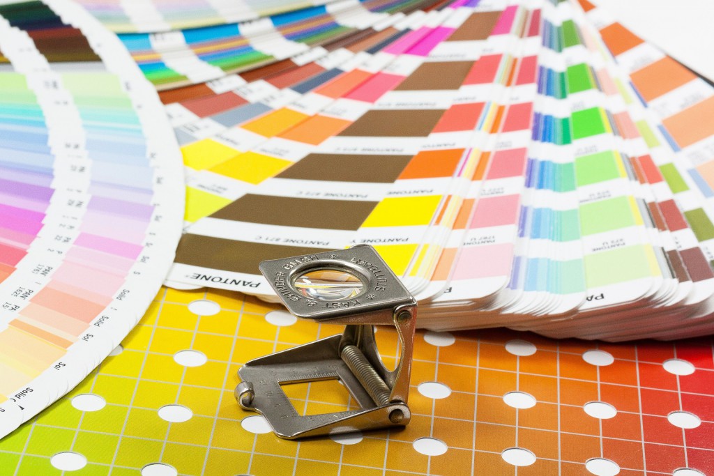
- Use Color Strategically: Color is a powerful tool in design. Use color to help convey your message and create an emotional connection with your target audience. Choose colors that fit your brand and help your message stand out. Be strategic in your use of color and avoid using too many colors, as this can create a cluttered design.
- Consider the Print Medium: Different print mediums have different requirements and limitations. Consider the print medium you’ll be using when designing your materials. For example, if you’re designing a business card, you’ll need to consider the size and orientation of the card. If you’re designing a flyer, you’ll need to consider the paper stock and finish.
- Balance Your Design: A well-balanced design can help guide the viewer’s eye and create a sense of harmony in your printed materials. Use the rule of thirds to help balance your design. This rule involves dividing your design into thirds both horizontally and vertically and placing important elements along these lines.
- Keep Brand Consistency: Consistency is key in building a strong brand identity. Make sure your printed materials are consistent with your brand guidelines. Use your brand colors, fonts, and logo in your designs to create a cohesive look and feel.
- Use White Space: White space or negative space, is the area of your design that is left blank. Don’t be afraid to use white space in your printed materials. White space can help guide the viewer’s eye, create a sense of balance, and make your design feel less cluttered.
- Consider Print Finishes: Print finishes can add a unique touch to your printed materials and make them stand out. Consider using finishes such as gloss or matte, foil stamping, embossing, or die-cutting to add texture and visual interest
- Use Contrast to Your Advantage: Contrast is an effective design element that can help make your printed materials stand out. Use contrasting colors, font weights, or sizes to create visual interest and draw attention to important information.
- Keep Hierarchy in Mind: When designing your printed materials, consider the hierarchy of your information. Determine what information is most important and make sure it stands out. Use font size, color, or bolding to create a hierarchy of information that guides the viewer’s eye.
- Consider the Purpose of Your Printed Material: The purpose of your printed material should dictate its design. For example, a brochure meant to showcase a new product should have different design elements than a business card meant to provide contact information. Consider the purpose of your printed material and design accordingly.
- Use Templates to Your Advantage: Using templates can help simplify the design process and ensure consistency across your printed materials. Look for free templates online or consider working with a printing service that offers customizable templates.
- Incorporate Brand Personality: Your brand personality should be reflected in your printed materials. Consider your brand’s tone, voice, and personality when designing your printed materials. Incorporate elements that reflect your brand’s personality to create a cohesive and memorable design.
- Test Your Design: Before sending your design to print, make sure to test it. Ask for feedback from colleagues, friends, or family to ensure that your message is clear, and the design is effective. Make adjustments as needed based on feedback. Print out a copy of your design and review it carefully. Make sure your message is clear, your images look great in print, and your design is balanced and visually appealing.
In conclusion, designing eye-catching printed materials requires careful consideration of various design elements, including simplicity, high-quality images, appropriate fonts, strategic use of color, consideration of print medium, balanced design, consistency with brand guidelines, use of white space, and testing before printing. Incorporating these tips into your design process can help you create materials that effectively communicate your message and leave a lasting impression on your target audience.
Don’t have time to design? You can use our free editable templates to get print items or request a custom design from Printivo.com

