In a highly digital world, it is not uncommon to think that letterheads are of little or no relevance. On the contrary, the use of letterheads takes your business to a higher level of professionalism and portrays it as up to the task.
Even though a larger percentage of business owners now communicate often using phones and emails, there is still some business communication for which letterheads are considered appropriate. This could be a letter of appointment/employment offer, an agreement between you and a supplier or business partner, and lots more.
Whatever function you’ll love your letterhead to perform, it is still worthy of note that great efforts be put into ensuring that they are good-looking and presentable. This is because they speak volumes about your brand wherever they are seen.
Here are a few tips for creating a Premium letterhead that speaks high of your brand.
1. Choose the Necessary Information
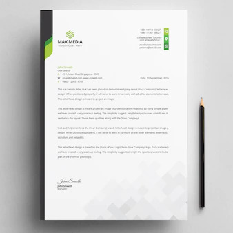
Your letterhead should contain adequate information about your business. In doing so, it is important you prioritize which information should be on your letterhead. You don’t want to make your letterhead look too irritating to your clients, right? Basically, information such as your business name, logo, address, phone numbers, and email address should never be missing on your letterhead. Of course, you could include other necessary details you deem fit.
2. Choose the Right Font
You would agree that it’s not lucid enough if readers have to take a second look to be able to read what is on your letterhead. Worse still, if readers cannot even see the information on your letterhead, that isn’t good enough. So, when choosing a font, ensure it’s such that is clear enough. You might decide to use the one your company is used to for more brand consistency. Whatever font you choose, clarity should be one of the basic determinants.
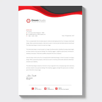
3. Choose your Brand Colors
To get a good-looking letterhead, your colors must align with that of your brand. That is, there should be a form of alignment in your colors. For instance, if your brand colors are white and blue, it’ll be unwise to print letterheads using gold and purple colors.
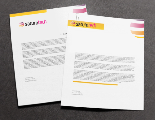
4. Choose your Layout
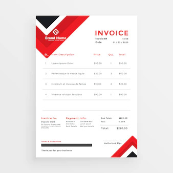
You can be creative about this but remember to keep it minimal. Your letterhead design should not be in competition with the wordings, it should rather act as support. The most common layout is the Header and Footer. This restricts the design to only the top and bottom of the page. However, if you would like to use other layouts, you could check our over 1000 templates on our website.
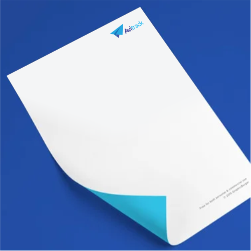
5. Use Quality Paper
The quality of your letterhead paper would go a long way to helping your clients and prospects figure out how competent, professional, and reliable your business is. It is therefore advisable that you use weighty papers. This would further make your brand stand out from the rest. Beyond that, ensure that it has a smooth and neat finishing. Anything different may just put off your clients and give a bad first impression about you and the services you offer.
Looking forward to printing premium letterheads? We would be more than willing to help make this a reality.
To get premium letterheads, visit printivo.